Introduction
Hey, you! Yes, you—the one who’s about to launch a brand or maybe give an existing one a fresh coat of paint. Ever paused to think why giants like Coca-Cola stick to red or why Tiffany & Co. is synonymous with that specific shade of blue? It’s not just a random pick from the color wheel, my friend. There’s a whole science behind it called the psychology of color, and it’s got a massive say in consumer behavior.
Now, you might be thinking, “Color? Really? How big of a deal can it be?” Well, let me tell you, it’s a game-changer. Imagine walking into a store with neon green walls and bright orange floors. You’d probably walk right back out, wouldn’t you? That’s color psychology at work, steering your emotions and actions without you even realizing it.
But hey, don’t just take my word for it. Numerous studies back this up. Researchers have found that up to 90% of snap judgments about products can be based on color alone. Yeah, you read that right—90%! So, if you’ve been neglecting this aspect of branding, it’s high time you paid attention.
In this article, we’re going to delve deep into the world of color psychology, its undeniable influence on branding, and how it sways consumer behavior. We’ll look at what colors evoke which emotions, how to choose the right palette for your brand, and even throw in some real-world examples to get those creative juices flowing. So buckle up, because we’re about to take a colorful ride into the heart of branding.
The Basics of Branding
What Even is Branding?
Branding is like your fingerprint in the business world—unique, identifiable, and telling a story about who you are. It’s not just slapping a logo on a product or coming up with a catchy slogan. Nah, it’s way more than that. It’s the sum total of how your brand looks, feels, and speaks to people. Basically, it’s your brand’s personality, and let’s be real, who wants to hang out with a dull personality?
The Elements that Make Up a Brand
Let’s break it down, shall we?
- Visual Identity: This is the fun part—logos, color schemes, and typography. It’s like choosing an outfit for your brand. You want to look good but also feel comfortable in what you’re wearing. Your visual identity should be a reflection of your brand’s ethos and vibe.
- Voice and Tone: Imagine your brand was a person. How would it talk? Would it be formal and sophisticated or casual and quirky? Your voice and tone set the stage for how you communicate with your audience. It’s the difference between “Greetings, valued customer” and “Hey there, awesome human!”
- Customer Experience: This is the big kahuna. It’s not just about a smooth online shopping experience or an easy-to-navigate website. It’s about how you make people feel when they interact with your brand. Do they leave feeling satisfied and valued, or frustrated and insignificant?
The Role of Visual Elements in Branding
Visuals are the cherry on top of your branding sundae. They’re what catch people’s eye and make them take a second look. But it’s not just about looking pretty; it’s about conveying a message. When you see a red octagon on the road, you know it means stop, even if you can’t read the word. That’s the power of visual elements. They can convey complex ideas in a simple, digestible manner. And in the world of branding, that’s gold.
So, why are we talking about all this in an article about color psychology? Because color is one of the most impactful visual elements. It can make or break your brand. It can attract customers or send them running for the hills. And that’s why understanding the psychology of color is crucial for any brand.
What is the Psychology of Color?
Defining the Term
Color psychology is like the secret sauce in a chef’s recipe—subtle yet transformative. It’s the study of how colors affect our emotions, decisions, and overall behavior. We’re not just talking about feeling “blue” or “seeing red”; it’s much more nuanced than that. This field of study has roots in both psychology and marketing, and it’s been a subject of fascination for centuries. From ancient civilizations using colors in rituals to modern brands splashing colors in their logos, the impact is undeniable.
The Science Behind Color Perception
Ever wondered how we even perceive color? It’s a fascinating interplay between light, eyes, and brain. Light waves hit an object, and the object absorbs some waves and reflects others. These reflected waves hit our eyes, and voila! Our brain interprets it as color. But here’s the kicker: Different cultures and individual experiences can influence how we interpret these colors. So, the color red might evoke feelings of love for some but can signify danger for others.
Real-World Examples
Let’s get real for a second. Think about hospital rooms; they’re often painted in soft blues or greens. Why? Because these colors are proven to have a calming effect, reducing stress and anxiety. On the flip side, ever notice how fast-food joints love the color red? That’s because red is known to stimulate appetite and even create a sense of urgency.
The Connection Between Branding and Color Psychology
Why Color Matters in Branding
If branding is the story, color is the cover of the book. It sets the tone for what’s inside. A well-chosen color can convey trust, stimulate excitement, or even incite action (ever wonder why clearance sales signs are red?). In short, the colors you choose for your brand aren’t just for aesthetics; they’re a powerful tool that can help you connect with your consumer on an emotional level.
Emotional Impact of Colors
Different colors evoke different emotions. Blue is often associated with trust and reliability—hello, Facebook and IBM! Green is the color of health and tranquility, which is why you’ll see it in organic or eco-friendly brands. And let’s not forget the luxury and sophistication that comes with black—think Chanel or Apple.
Case Studies: Brands Doing it Right
Ever heard of a little company called Coca-Cola? Of course, you have. Their use of red isn’t just iconic; it’s strategic. Red evokes excitement, passion, and even urgency—all emotions that fit perfectly with the brand’s image. Another example? Tiffany & Co.’s signature blue. It’s not just any blue; it’s Tiffany Blue, a color that screams elegance, sophistication, and timeless beauty.
How Different Colors Affect Consumer Behavior
The Influence of Warm Colors
Red, Orange, Yellow: The Attention-Grabbers
Warm colors like red, orange, and yellow are the life of the party. They’re bold, energetic, and impossible to ignore. Take red, for example. It’s the color of passion, excitement, and even urgency. Ever wonder why clearance signs and call-to-action buttons are often red? It’s because red prompts action. It’s like a little nudge, saying, “Hey, do something!”
Emotional Responses to Warm Colors
- Red: Evokes strong emotions, increases heart rate, creates urgency—often seen in clearance sales.
- Orange: Energetic and fun, this color is great for calls to action like subscribe, buy, or sell.
- Yellow: Optimistic and youthful, often used to grab attention in window displays.
Real-World Examples
Think McDonald’s or Shell. The red and yellow combo isn’t just eye-catching; it’s appetite-stimulating and energizing. These colors make you want to stop, eat, refuel—both your car and yourself—and move on.
The Influence of Cool Colors
Blue, Green, Purple: The Calm, Cool, Collected
On the other end of the spectrum, we’ve got our cool colors. These hues are all about calm, peace, and trust. Blue, for instance, is often associated with tranquility and reliability. It’s no wonder you see it in healthcare and corporate settings. Green, with its ties to nature and health, is often used for organic or eco-friendly products.
Emotional Responses to Cool Colors
- Blue: Associated with tranquility, reliability, and also sadness in some cultures.
- Green: Symbolizes health, tranquility, and nature—often used in stores to relax customers.
- Purple: Associated with royalty, wealth, and success—often used in beauty or anti-aging products.
Real-World Examples
Take a look at brands like Facebook, Twitter, or even Oral-B. They all use blue to convey a sense of trust and reliability. And what about Starbucks with its iconic green logo? It’s not just about coffee; it’s about community, relaxation, and a bit of eco-friendliness.
Most Popular Brand Colors and Their Emotional Impact
Here’s a table that breaks down some of the most commonly used brand colors and the emotions they typically evoke. This could be a handy reference when you’re deciding on your own brand colors.
| Color | Emotional Impact | Popular Brands Using the Color |
|---|---|---|
| Red | Excitement, Urgency | Coca-Cola, Netflix |
| Blue | Trust, Calm | Facebook, Dropbox |
| Green | Health, Tranquility | Starbucks, Whole Foods |
| Yellow | Optimism, Youthfulness | McDonald’s, IKEA |
| Orange | Energy, Fun | Home Depot, Nickelodeon |
| Purple | Luxury, Creativity | Cadbury, Hallmark |
| Black | Sophistication, Luxury | Chanel, Apple |
| White | Purity, Simplicity | Apple, Tesla |
The Do’s and Don’ts of Using Color in Branding
Best Practices for Choosing Your Brand’s Color Palette
Picking the right colors for your brand isn’t a game of eeny, meeny, miny, moe. It’s a calculated decision that can make or break your brand image. So, where do you start?
- Understand Your Audience: Different cultures have different interpretations of colors. Make sure you know who you’re talking to.
- Align with Brand Personality: Your colors should reflect your brand’s ethos. A fun, youthful brand might opt for bright, vibrant colors, while a luxury brand might go for muted, sophisticated hues.
- Test, Test, Test: Before you go all-in, test your colors. Use A/B testing on your website, or even conduct consumer surveys.
Common Mistakes to Avoid
- Overcomplicating: A rainbow might be beautiful, but it doesn’t belong in your branding. Stick to a simple color palette.
- Ignoring Contrast: Make sure your colors are easily distinguishable. You don’t want your text to blend into the background.
- Forgetting Accessibility: Keep in mind color blindness and how your palette might appear to those with visual impairments.
Quick Tips for a Color Audit
- Check Consistency: Make sure your colors are consistent across all platforms.
- Seek Feedback: Sometimes, you’re too close to the project to see any issues. Get an outside perspective.
- Review Regularly: Trends change. Make sure your colors are still relevant and effective.
Real-Life Success Stories
Brands That Nailed Their Color Psychology
Let’s talk about some brands that got it oh-so-right. Take Dropbox, for example. Their use of blue isn’t just pretty; it’s strategic. Blue evokes feelings of trust and reliability—exactly what you want when you’re storing your important files.
What We Can Learn from Them
- Consistency is Key: Once you pick a color, stick with it. Consistency helps with brand recall.
- Emotion Over Logic: People buy based on emotion and justify with logic. Your color should tap into that emotion.
- Less is More: You don’t need a plethora of colors to make an impact. Sometimes, a single color does the trick.
Case Studies: Brands Doing it Right
- Coca-Cola: The red screams excitement and passion.
- Tiffany & Co.: That signature blue is the epitome of elegance.
- Starbucks: The green not only represents the coffee but also the community and eco-friendly vibe.
How to Implement Color Psychology in Your Branding Strategy
Steps to Choose the Right Color Scheme
Choosing the right color scheme is like picking the perfect outfit for a first date. You want to make a great impression, but you also want to feel like yourself. So, how do you go about it?
- Know Your Brand Inside Out: Before you even look at a color wheel, understand what your brand stands for. Are you all about luxury, or maybe you’re the fun, quirky type?
- Research Your Audience: Different strokes for different folks, right? What resonates with one demographic might not work for another.
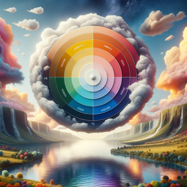
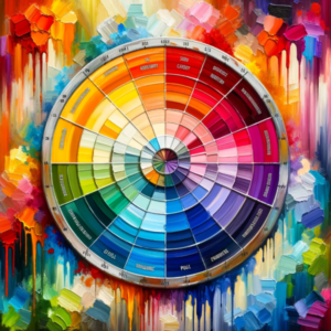
- Consult the Color Wheel: Now comes the fun part. Use a color wheel to identify complementary colors that align with your brand’s message.
Tools and Resources for Color Selection
- Adobe Color: A fantastic tool for creating and exploring various color schemes.
- Coolors: Great for generating color palettes quickly.
- Color Hunt: Offers a plethora of curated color palettes to choose from.
Measuring the Impact on Consumer Behavior
So you’ve picked your colors, implemented them, and now what? Sit back and observe. Use analytics tools to measure metrics like engagement rate, click-through rate, and conversion rate. Are people more engaged? Are they clicking where you want them to click? The numbers will tell you if your color choices are hitting the mark.
Conclusion
Alright, let’s wrap this up. We’ve journeyed through the fascinating world of color psychology, its impact on branding, and its undeniable influence on consumer behavior. We’ve seen how different colors evoke different emotions and how crucial it is to pick the right hues for your brand. It’s not just about looking good; it’s about feeling right to your consumer.
Call to Action
Ready to leverage the power of color psychology in your branding? Contact Nesace Media today to elevate your brand to new heights. Let’s make your brand not just seen, but felt.


